As I had the general outline for the UX/UI finished, I wanted to make a better design of how the app would look like. So, I searched on google to see what I could use, and found material design. I thought this would help me a ton in creating a better-looking flowchart.
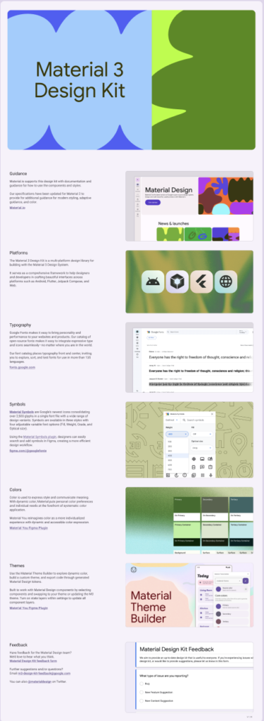
It looked like it had icons such as buttons and inputs, with customizable features like size and color. I created a new board in Figma and started working on it.
But when I first started, material design was much less convenient than I thought. It was complicated to customize the icons and their placement, and I was pretty frustrated at first. I did manage to get the hang of it (a little) later on, but it was still slow. Below are the first two screens I designed.
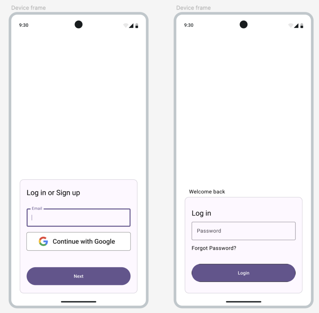
Although it looks much better than the black-and-white outline version, it still didn’t fulfill my expectations. I still think it looks too much like Google – it looks like it’s straight out of google forms.
I thought it was mostly because of the color and font, so I change the color to turquoise and the font to Pretendard. I also created another screen for choosing the role (volunteer or organization). Below is the result.
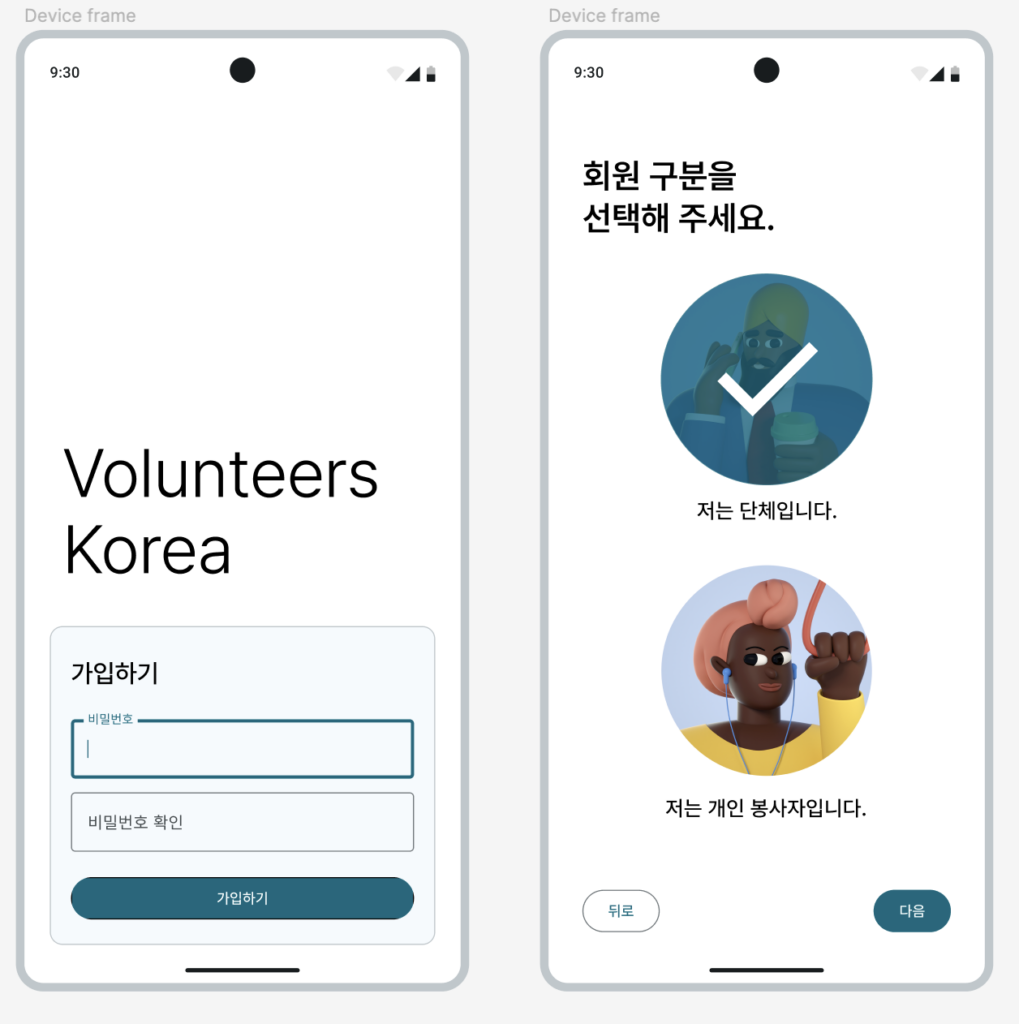
I’m much happier with this version than the purple one above. For now, I’m pretty satisfied with the results. I’ll continue to create more screens and see what’s missing or what should be improved. Now that I’m building the screens with more care and attention to detail, I can identify problems better than in the outline. I’ll continue to build more screens and go from there, and I’ll check for problems along the way.